Superior, a leading producer of valves, quick couplers, and adaptors for the irrigation industry, unveiled a new brand identity and brand campaign reflecting the company’s commitment to quality, innovation, reliability, efficiency, and durability. The new name, brand identity and campaign are inspired by Superior’s 109-year-old heritage while reinventing itself for today’s modern irrigation industry. Superior’s new look and feel represent a commitment to design and innovation and solidifies the company’s stance as an industry leader in efficient irrigation solutions. It honors who Superior was while focusing on continually delivering excellent value to their customers both old and new.
“Superior is the evolution of three highly regarded irrigation brands: Buckner, Superior Controls, and Western Brass,” Noted Brian Babb, Superior’s president. “Our history extends back over a century to when Buckner was founded in Fresno, California. Since our beginnings we have been innovators in the irrigation industry and integral to the maintenance and beautification of landscapes and crop production across America.” “These brands have grown and evolved to become consolidated under the Superior Brand. And our brand relaunch represents the natural evolution of that transformation,” said Brian Babb, Superior’s President. “It is essential that we respect and honor the core values that built this great company over its 109-year history; but it is equally essential that we never stand still. We continuously innovate to ensure that Superior is positioned to meet the changing needs of our customers.”
Today, Superior products continue to honor the legacy of our founders through their performance, dependability, reliability, innovation, and efficiency. It is imperative for the brand to reflect and promote the company as it is today and the fantastic value it brings. This commitment is highlighted through a new brand campaign centered around two key statements: “The Superior Choice in Irrigation” and “Efficient Irrigation Starts with Superior Design”. The Superior brand is committed to delivering upon these promises to their customers through quality, innovative Superior products, and services.
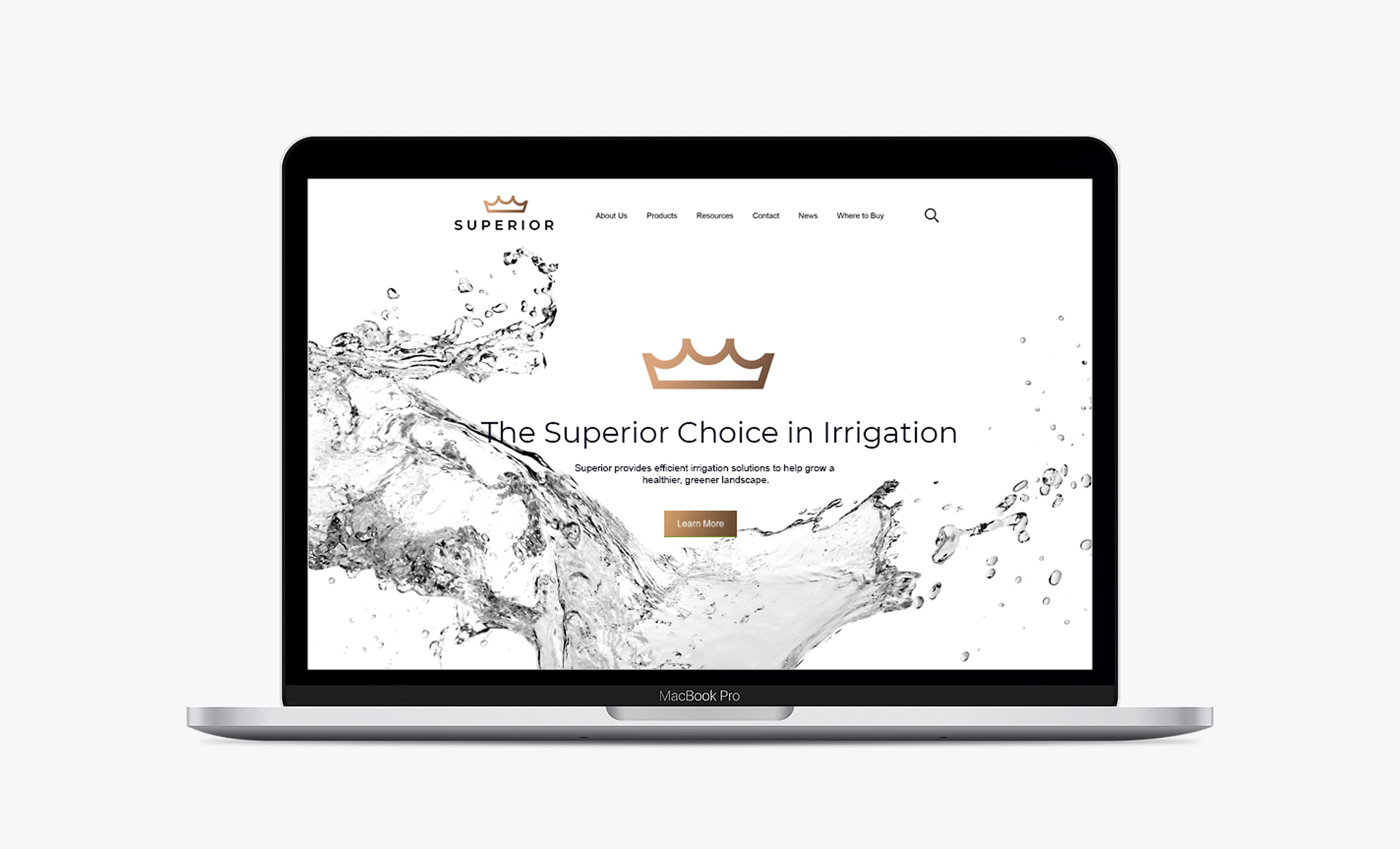
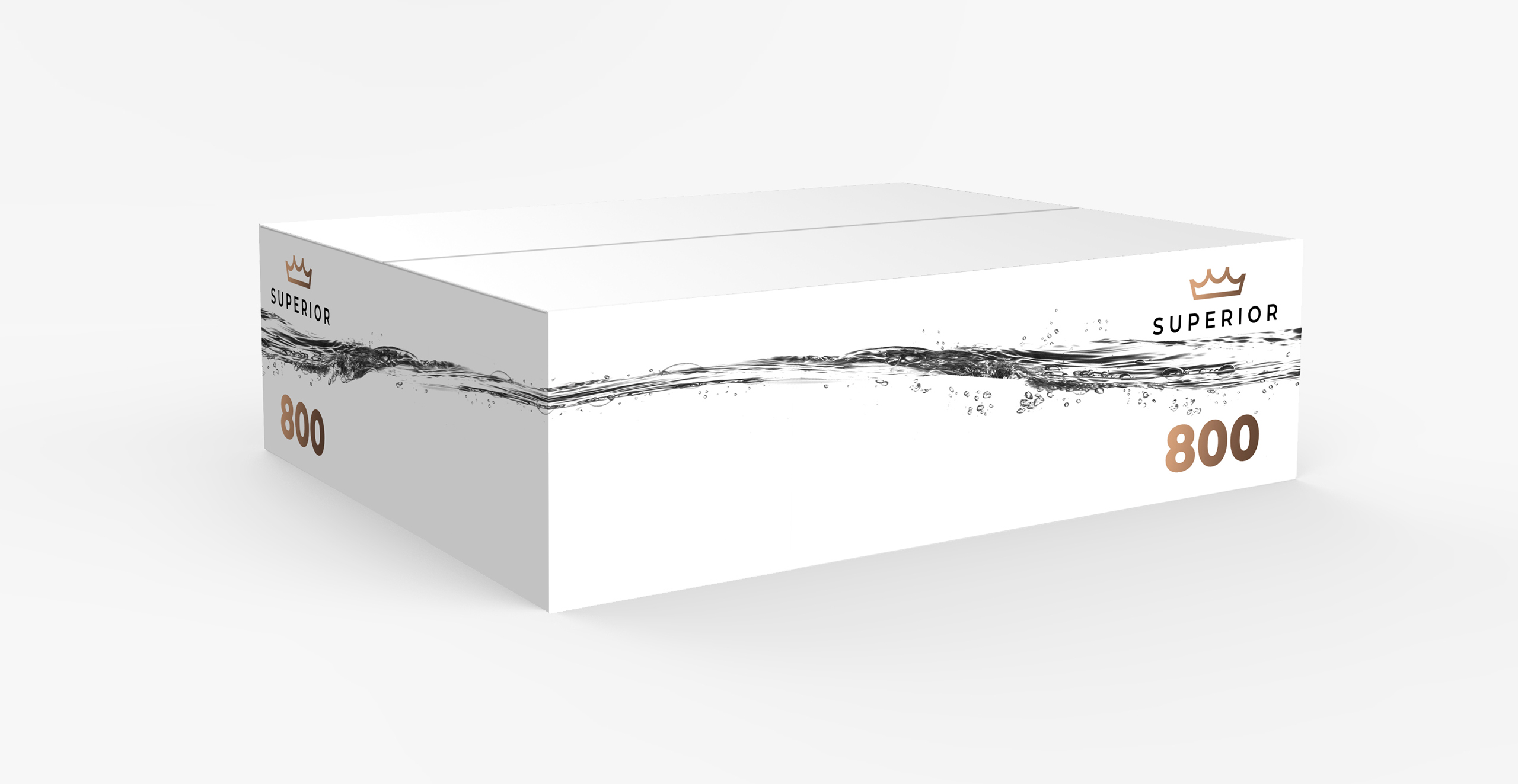
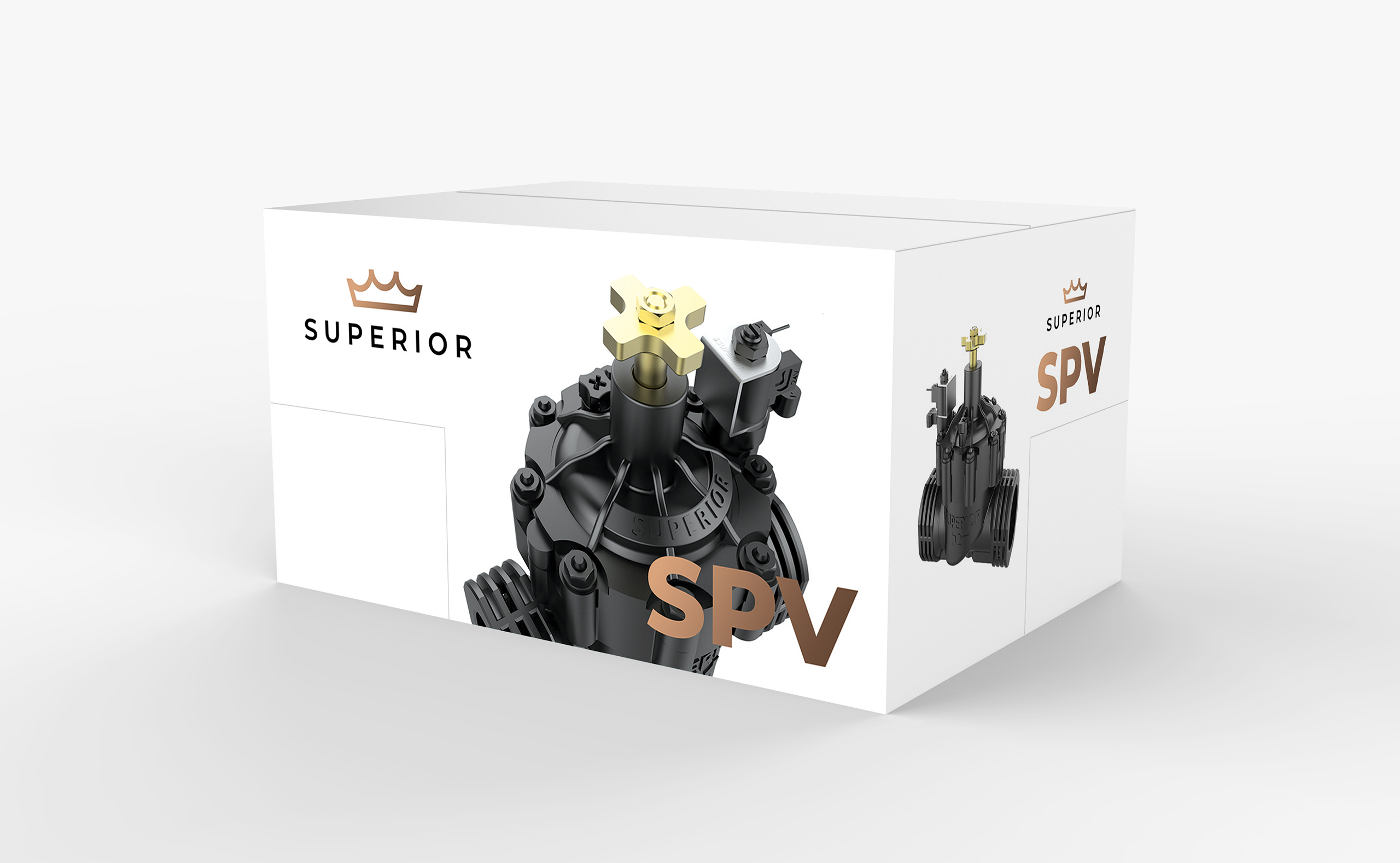
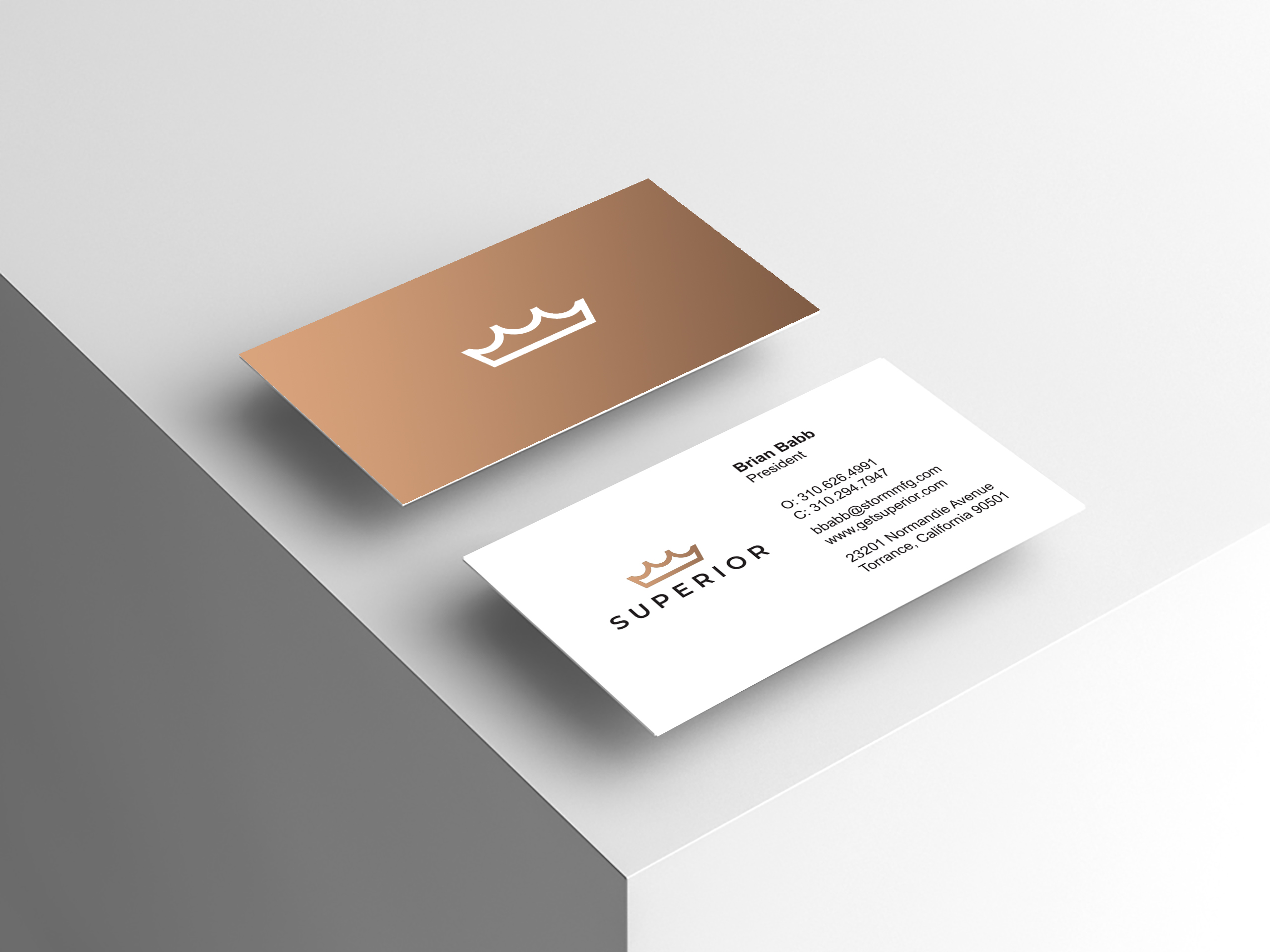
At the center of the new brand identity stands the new logo. The new logo is a modern representation of a crown as well as graphic representation of the splash a drop makes in a pool of water. The logo shows Superior’s market positioning, focus on excellence, and superior water efficiency in irrigation. The new brand color, metallic ‘bronzed brass’, speaks to Superior’s rich history built upon brass valves. The new logo evokes confidence in an industry rife with inferior products and services. As a prominent representation of the company, people and brand, the new logo is modern, iconic and smart. An updated website was introduced reflects the new brand identity and highlights the company’s positioning advantages and competitive strengths. The newly redesigned website features easy to navigate pages and updated, strong, direct, impactful messaging. The visual design showcases Superior’s commitment to quality, durability, reliability, and efficient irrigation. The branding has been updated significantly to better represent who Superior is and what they bring to market for their customers. The new identity is modern, innovative, and professional – words we would use to describe not only our image but also the products and services Superior provides to their customers. The new brand identity presents the company as modern and evolving while better communicating Superior’s strengths.
