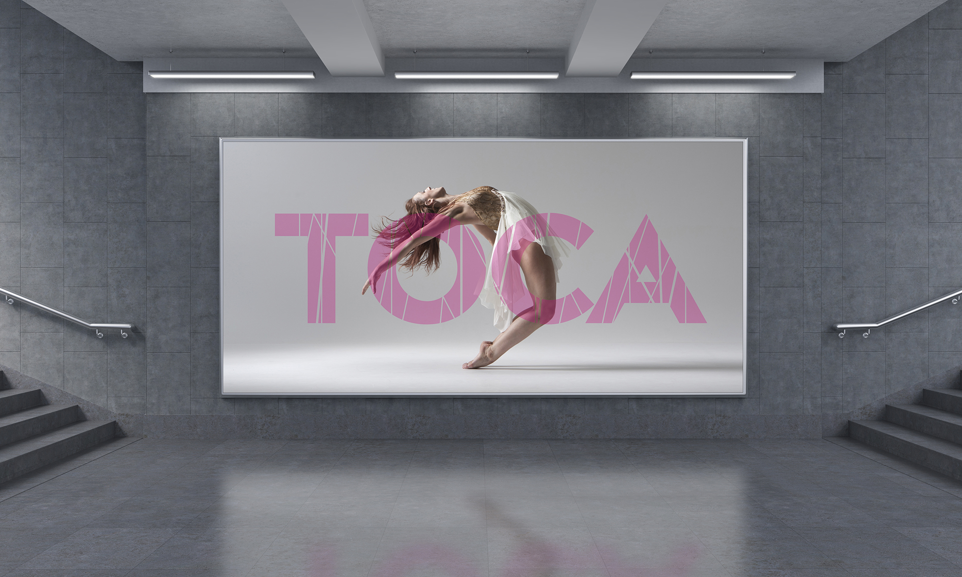
For over 20 years, the Torrance Cultural Arts Foundation has been providing the highest quality of performances and arts experiences to Torrance and the South Bay. The Foundation is dedicated to enriching the communities of the South Bay through the Arts. The problem was that the foundation was in a transition period and needed a progressive, new branding identity to help propel the Foundation forward and reinforce the values established to cement the Torrance Cultural Arts Foundation as the cultural epicenter of the South Bay
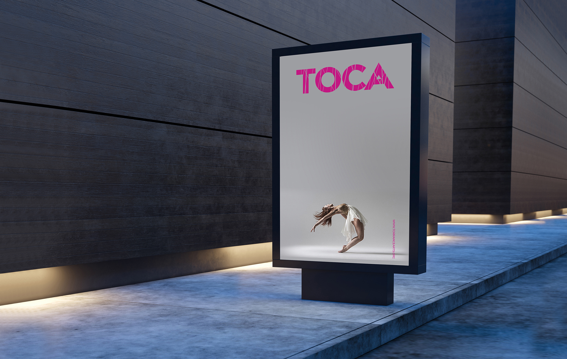
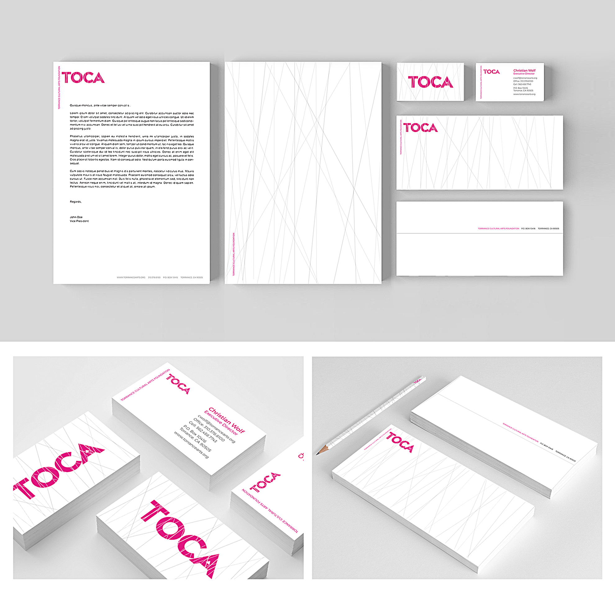
Prior to the new identity the Torrance Cultural Arts Foundation was commonly known as TCAF. There was a need to distance the Torrance Cultural Arts Foundation from abbreviations and ambiguity to create a word that would become synonymous with the city of Torrance and the Arts. TOCA became the rally point that blended the line between abreviation and word. It allowed the foundation to be paired among the likes of institutions such as MoMA and trendy areas such as Soho and Weho. A celebration of nonconformity and diversity, the new logo is composed of dramatic angles and shapes coming together to create a cohesive image that brings together the varying facets of the Arts. The lines are also representative of spotlights that highlight performers while on stage and address a multi layered focus on diversity within the arts. The letters, large and bold, create a dramatic statement that, like the artists themselves, doesn’t fear standing out from the crowd. In short, the logo is designed to be as dynamic, bold and diverse as the Arts.
